18% of U.S. online shoppers abandoned an order in the previous quarter because the checkout process was too long or complicated, according to Baymard Institute's usability research. Baymard's checkout testing also found that an effective flow could be reduced to as few as 12 form elements, while the average U.S. checkout displayed 23.48 form elements by default. A landing page sits earlier in the funnel than checkout, and the same leak applies. Extra fields, a second competing button, and a headline that doesn't match the ad all spend budget on visitors who never become leads.
A good landing page handles the earlier half of that job. It turns a visitor from an ad, an email, or a search into one named action, then hands that person to a sales or service process you can measure.
Judge the page by qualified conversions and the revenue behind them. Usability decides whether visitors complete the step, and attribution decides whether you can prove the step paid. Clicks that never become a quote, a booked consult, or a purchase are a cost.
The Landing Page Scorecard at a Glance
A good landing page does one job. It moves a visitor who arrived with a specific intent into one next step, such as a demo request, a quote, or a purchase. Score the page in about ten minutes. Give each row a 1 or a 0. Any zero is the first fix, because one broken row can cancel the other five.
| Principle | What good looks like | Red flag | Quick test |
|---|---|---|---|
| Value proposition | Headline states the outcome in under ten words and matches the ad | Generic claim such as quality service for everyone | Show the page to a stranger for five seconds and ask what they get |
| Primary CTA | One button with a specific verb, repeated after the proof | Two or more competing buttons of equal weight | Count the buttons that look primary; the answer should be one |
| Form | Only fields needed for the next step, each with a reason | Fields asked for out of habit | List every field and name who uses it |
| Trust signals | Named reviews, client results and logos near the CTA | Unsourced claims or a stock testimonial | Check whether proof sits within one screen of the CTA |
| Navigation | Links kept only where they answer a blocking question | Full site menu on a single-goal page | Remove each link in turn and ask whether the visitor would miss it |
| Mobile | Complete page on a phone with thumb-reachable buttons | Form that requires zooming or a sideways scroll | Load the page on a phone and complete the form with one thumb |
How to score a live page
Open the ad and the page side by side. Read the headline out loud. If it could sit on a competitor's site without a rewrite, that row is a zero. Then count primary-looking buttons. Two equal buttons split the decision, and the visitor often takes neither.
Work the form next. Write the name of the person who uses each answer this week. A field with no owner is habit, not qualification. Place proof within one screen of the button, then check links. Keep a link only when it answers a question that would otherwise stop the action.
Finish on a phone. Complete the form with one thumb. If you pinch to zoom or scroll sideways, mobile is a zero. Add the six scores. Fix the lowest row before you change colors, fonts, or ad creative. A page can look finished and still fail the only test that matters, which is whether a stranger can name the offer and complete it. If you want a benchmark for the rate that follows, start with what counts as a good conversion rate and tie it to qualified leads, not raw clicks.
Practical rule: Score the page out of six, and treat any zero as this week's only change.
Lead With a Value Proposition Visitors Grasp Fast
Think of the ad as a promise painted on the sidewalk. The landing page is the door that promise opens. People leave when the room looks like a different business. Message match is that continuity, visible in a few seconds, before anyone reads a paragraph.
A value proposition has three parts, and all three have to be visible without scrolling on a laptop.
Outcome. Say what changes for the buyer. "More booked repair calls" is an outcome. "Professional marketing services" is a category label.
Audience. Name who it's for. An HVAC owner, a clinic manager, or a franchise operator should recognize themselves in the first line.
Proof. Give one concrete reason to believe the outcome. A licence, a response-time promise, or a named result beats an adjective.
A headline you can actually test
Weak: "Professional marketing services."
Stronger: "More qualified leads for your HVAC business, from one partner."
The second line states the outcome, the audience, and the shape of the relationship. It also repeats the offer from the ad, so the click doesn't feel like a bait-and-switch. Under it, use a subheadline that says how the outcome happens, then three benefits and nothing more. Three items are easier to remember than seven. A visual should show the product, a technician, a customer, or a real result. A stock handshake carries no information, and neither does "better results."

The sign on that entryway works because it names a felt outcome in a few words. Your headline should do the same job for a commercial offer. If the ad promised same-day repair, the page shouldn't open with a company history.
The one-minute rewrite
Take your highest-spend ad and write three lines only.
- Headline: the offer, in under ten words, using the ad's own phrasing.
- Subheadline: how you deliver it, in one sentence.
- Button: the next step, as a verb the visitor would say out loud.
Show those three lines to someone who didn't build the page. After five seconds, they should name the offer, the audience, and the next step. If they name your company instead of the outcome, rewrite before you touch design. Strong advertising copy earns the click, and the page has to keep the same promise or the spend stops at the door.
CTAs and Form Friction
A landing page earns one dominant action. "Book a growth consult" beats "Submit." "Get my quote" beats "Learn more" once the visitor is ready to act. Vague verbs hide the next step, and hidden next steps get skipped. A brochure download, a phone number, or a chat widget can stay on the page, as long as each sits visually below the main button and doesn't compete with it.
Place that button above the fold, then repeat the same label after each proof block. Don't invent a second verb halfway down. A changed label makes people wonder whether the second button does something different.
Run a field audit before you shorten anything
Baymard Institute's large-scale checkout usability research puts numbers on form friction: 17% of US online shoppers have abandoned an order because checkout was too long or complicated, the average checkout displays 23.48 form elements, and large ecommerce sites could gain roughly 35% in conversions by improving checkout usability alone. Treat those figures as checkout proxies rather than promises for a lead form. The mechanism still travels: every extra field adds effort, errors, and a sense of commitment before the visitor gets anything back.
The smallest form that still protects lead quality is the goal.
List every field. For each one, write who uses it and when.
- Keep a field when someone on your team needs it to qualify or fulfill the request this week. Name, service needed, and a way to reply usually qualify.
- Move a field when it's useful later. Budget range, company size, and marketing history can wait for a second step or a CRM record after the lead exists.
- Delete a field nobody opens. "How did you hear about us" collected out of habit is a tax on completion.
Use input types the browser can autofill. Put the error on the field and name the problem: "Enter a 10-digit phone number," not "Invalid input." If you ask for a phone number, add one short line on why, such as "We'll call only to confirm the appointment window." The fields you keep also shape your attribution: a lead record with service type and city tells you which campaigns produced qualified requests, while a bare email address tells you nothing.
A three-part test you can ship this week
Remove one nonessential field. Add one explanation beside a sensitive field. Rewrite one error so it says what to fix. Then compare variants on qualified-lead rate, cost per qualified lead, completion rate, and downstream revenue. Raw submissions flatter a form that attracts people you can't serve. Progressive profiling lets the CRM collect the rest after the first yes, which is the point of conversion rate optimization that measures revenue rather than form fills.
A field with no owner this week doesn't belong on the first step.
Layout, Navigation and Trust Signals That Build Confidence
People scan from top to bottom. Build the page as a path, not a brochure. Headline and primary button come first. Proof comes next. Then a short explanation, answers to the objections that stop this audience, and the same button again. If the history of the company appears before the offer, you're asking for trust you haven't earned yet.
Trust arrives in three layers, and they do different jobs.
Credibility is who you are. Named clients, a licence number, a certification, and years in operation answer "are you real."
Social proof is what happened for someone like the visitor. Reviews and case results with specific numbers outperform a quote that could have been written by anyone. Put that proof near the button, not in a footer carousel nobody reaches.
Risk reducers answer what happens after the click. A response-time line, a clear description of the next conversation, and any guarantee you honor lower the cost of saying yes.
A legal intake page can put attorney credentials and "we reply within one business day" beside the form. A local service page can put the review count and "licensed in your area" on the same screen as the button. In both cases the visitor's question gets answered before they have to hunt.
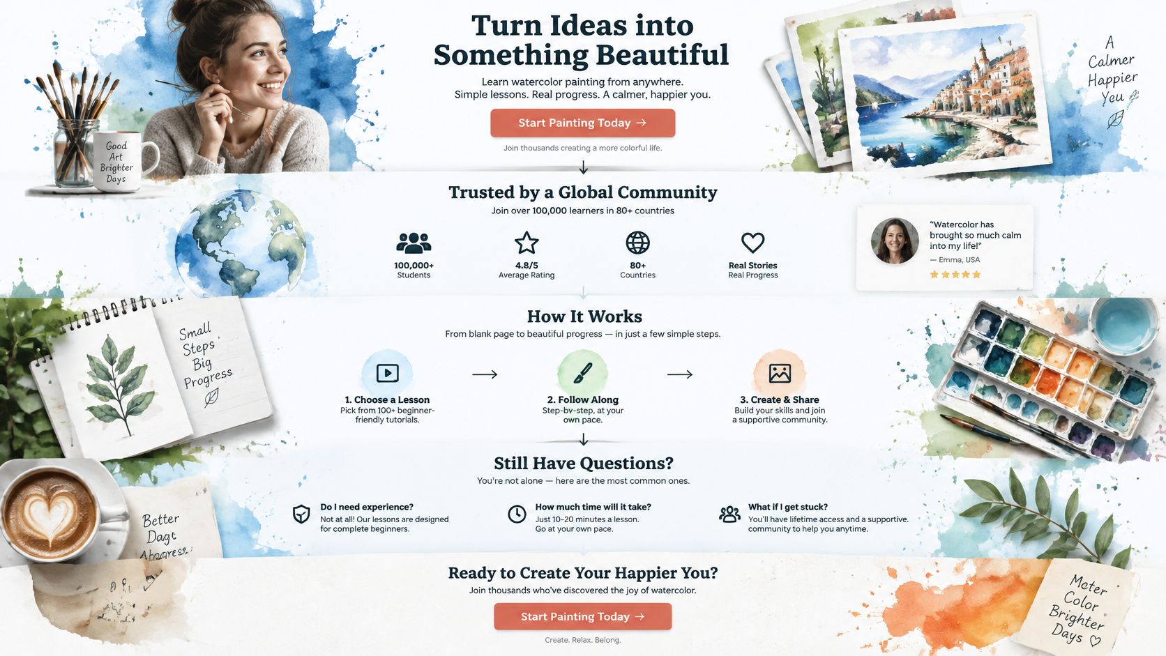
That course page keeps the offer, the feeling of the work, and the testimonials in one reading path. The proof doesn't compete with the class. It sits where a hesitant buyer looks while deciding.
Which links to keep
Stripping every exit isn't automatically better. In a test of five landing pages covered by HubSpot's landing page navigation write-up, removing navigation produced only a 0–4% lift for top-of-funnel pages, while middle-of-funnel pages gained 16% and 28%. Cold visitors often need a path to proof, pricing, or who you are before they'll convert. High-intent visitors, the ones who already understand the offer, convert faster when those exits disappear.
Keep a link only if it answers a question that blocks the primary action. Sort the rest into remove. A download and a plan comparison are secondary actions. Style them as text links, not as a second button of equal weight. For founders who have been burned by vague claims, credibility beats an empty page. Social proof in advertising only helps when the proof is specific and placed where the decision happens.
Speed and Mobile Experience Visitors Actually Feel
Speed is whether the offer shows up before patience runs out, whether a tap does something immediately, and whether the button stays where the thumb expected it.
| Metric | Good threshold | What it means on a landing page |
|---|---|---|
| Largest Contentful Paint (LCP) | 2.5 seconds or less | The headline and hero image appear before visitors lose patience |
| Interaction to Next Paint (INP) | 200 milliseconds or less | Form fields and buttons respond immediately on tap |
| Cumulative Layout Shift (CLS) | 0.1 or less | The CTA button does not jump as the page loads |
If the hero is a huge uncompressed photo, LCP slips and the headline arrives late. If a script blocks the main thread, INP slips and the form feels broken. If a banner injects above the button after load, CLS slips and people tap the wrong thing.
Five checks on a common phone
- Headline and button without a scroll. On a typical phone screen, both are visible before the thumb moves.
- Targets with space. Buttons are large enough to tap without zooming, and neighboring links don't sit against them.
- A form that fits. Fields stack in one column, and each field opens the right keyboard, numeric for phone and email for email.
- A hero that loads first. Images are compressed and sized for the screen, so the offer appears before the first scroll.
- No cover on load. A pop-up doesn't hide the button the moment the page appears.
Accessibility is a revenue check
A 2025 audit of ecommerce journeys reported by Contentsquare found that 94% of sites had inaccessible checkout experiences, with barriers in forms, keyboard navigation, screen readers, and visual accessibility. Another study reported that only 11% of evaluated cart and checkout pages met minimum WCAG standards. Those are checkout audits, and the lesson for a lead page is the same. The path after the click is part of the page. An inaccessible form wastes money the ad already spent, even when the targeting was right.
Labels should be announced by a screen reader, not placeholder text that vanishes. Someone should be able to move through every field with a keyboard. Contrast has to hold on a bright phone outdoors. Error text has to say what failed. Complete the form using only the keyboard, once on a phone and once on a desktop, and write down the field where you stop. That stop is where paid visitors stop too.
Good and Weak Landing Pages Side by Side
The gap between a weak page and a strong one is usually order, not effort. Read the two examples below as illustrations of the decision a visitor has to make, then validate any version you ship against your own leads before treating either pattern as a rule.
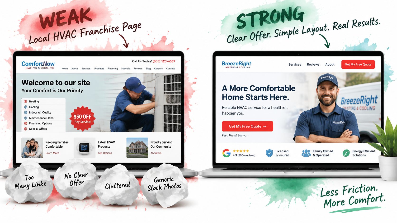
A local HVAC franchise
| Element | Weak page | Stronger page |
|---|---|---|
| First screen | Stock photo and "Welcome to our site," plus five navigation links offering the whole company | "Same-day AC repair, with a quoted price before we arrive" |
| Proof | No credentials or reviews near the top | Technician's photo and licence number near the headline, review count beside the button |
| Quote form | 14 fields, including questions nobody on the dispatch desk will read before the first call | Four fields: name, phone, address or ZIP, and what's wrong with the system |
A homeowner with a warm house wants to know whether someone can come today and what it will cost. The weak page answers with a company tour. The stronger page answers the question the visitor arrived with before the form asks for anything, and the four fields match the next operational step instead of a marketing database wish list.
An in-house legal intake page
An anxious visitor reads this page in a different order than the firm wrote it. They want to know how to ask for help, who will read the request, and when they will hear back. The stronger version follows that sequence: "Request a case review" sits above the fold, one line states the response time, and attorney credentials sit beside the form. That pairing reduces the fear of sending a private matter into a void.
The weak version spends the first screen on firm history and puts the button underneath it. Firm history still matters; it belongs lower on the page, for the visitor who is not yet sure.
A four-field form that attracts the wrong jobs is a worse page than a six-field form that screens them. Judge each change by your qualified-lead rate and cost per qualified lead: adopt the ordering these pages demonstrate, then set the field count against the leads your team can work.
Testing Your Landing Page Before You Scale Spend
A test without a defined conversion is a vote on clicks. Set a qualified conversion first. A qualified lead is someone your team can work, not every form submit. Use the same definition in every report, or you'll "win" a test that only produced cheaper junk.
Google's data-driven attribution assigns credit by comparing paths that convert with paths that don't, then gives more credit to touchpoints that show up as more valuable. Google recommends at least 200 conversions and 2,000 ad interactions in supported networks during a 30-day period before that model has enough data. Below that volume, use a simpler rule and say so in the report. Don't let an advanced label hide a thin sample.
Fix the counting rules before the first variant
In Google Ads, each conversion action records either One conversion after an ad interaction or Every conversion, and Google's conversion counting guidance treats that choice as part of the goal setup. A lead form usually wants One, so a person who submits twice isn't two leads. A repeat purchase often wants Every. Mix those up and the test lies.
Counts also disagree across tools. Google's comparison of Ads and Analytics reporting notes that Analytics reports may be fully processed after a 72-hour window, while Google Ads uses a conversion window from 1 to 90 days, defaulting to 30. Ads doesn't use sessions and can count multiple conversions in a date range. Pick one source for the decision. Reconcile the other in a note, and don't stop a test because the two dashboards told different stories on day two.
One variable, in this order
Change the headline before you restyle the page. Message match moves more qualified demand than a new color. Form length is next, because friction hits everyone who is ready. Navigation and proof placement come after, and they often differ by traffic source.
| Test | Hypothesis | Primary metric |
|---|---|---|
| Headline | Matching the ad's exact offer lifts qualified leads | Qualified-lead rate |
| Form length | Removing non-essential fields raises completions without hurting lead quality | Cost per qualified lead |
| Navigation | Removing links helps high-intent visitors but not cold ones | Qualified-lead rate by traffic source |
| Proof placement | Reviews placed above the form reduce hesitation before submission | Form completion rate |
Run each test until it has enough qualified conversions to read. A two-day spike in leads is not a winner. We test, measure, and optimize campaigns rather than guessing, and the same discipline belongs on the page that receives the traffic. Track three numbers on every test: qualified-lead rate, cost per qualified lead, and form completion rate. If completion rises and qualified-lead rate falls, you made the form easier for the wrong people. For the mechanics of running the variants cleanly, use a landing page split test with one change and one decision metric.
Book a Growth Consult to Audit Your Page
Score the live page with the six rows, and fix the lowest row this week. A page where one row sits at zero does not need a redesign. It needs that row fixed first.
A practical audit has two steps. First, write down the conversion goal, the ad or channel that sends people there, and the number of fields on the form. Second, put the headline next to the ad copy and mark every phrase that doesn't match. That gap is usually why qualified traffic arrives and then leaves.
If you want a second set of eyes on those six rows, start with the Request a Demo or Book a demo buttons. The Advertising Suite consolidates your marketing under one roof, so the page, the ads, the CRM, and review management get reviewed as one funnel instead of four vendors blaming each other. Members also get access to the proprietary CRM and automated review management software, which means what the audit finds connects directly to what happens after a lead submits the form.
More than 10,000 brands have used that results-first approach instead of buying another round of clicks. The standard stays the same whether you run the audit yourself or with help: fix the worst row, then judge the page on qualified leads and revenue, not the click report.
We'll sit in as an extension of your team, with the same scorecard you can already run yourself.
The Advertising Suite is a growth-tech partner that ties ads, landing pages, CRM follow-up, and reviews to qualified revenue instead of vanity clicks. If your page is leaking the demand you already pay for, The Advertising Suite can audit the offer, the form, and the path after the click with you. Book a growth consult and bring the ad, the page, and last month's qualified-lead count.